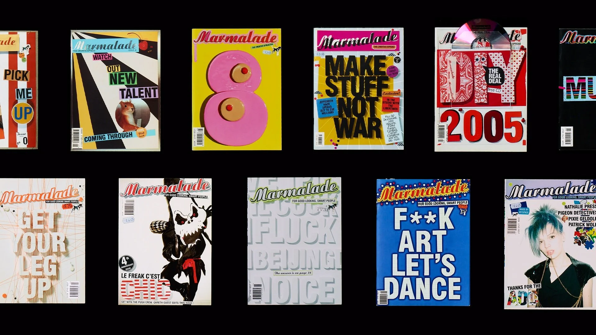
MARMALADE MAGAZINE, ART DIRECTION AND PUBLISHING
D&AD 2005 FULL MAGAZINE DESIGN
Marmalade was a magazine that was for creatives and was created by creatives, focusing on contemporary culture.
The magazine's art direction took an experimental approach, with each page featuring a real 3D collage that was captured through photography. To establish visual consistency, the magazine followed strict graphic rules for fonts and grid layout, allowing the collages themselves to have more creative freedom.
Every issue explored a different visual theme, incorporating three key materials for each theme.

The digital archive of the magazine has been lost, so we are re-shooting every page of each magazine. Here are some spreads from a few issues, more to come.
Issue: F**k Art, Let’s Dance issue
Materials: Graph paper, compound cardboard and preserved insects.


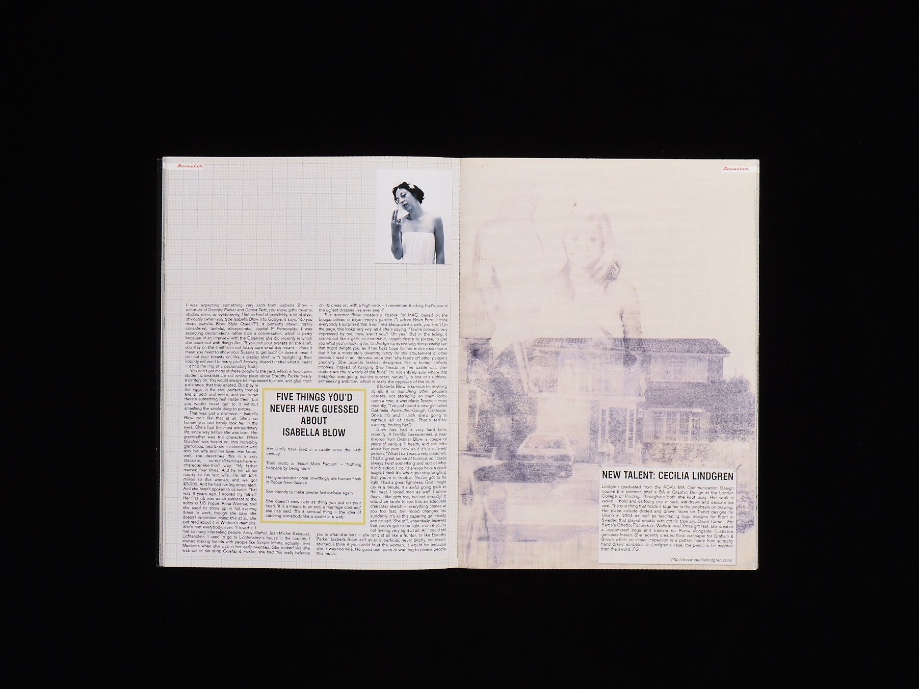


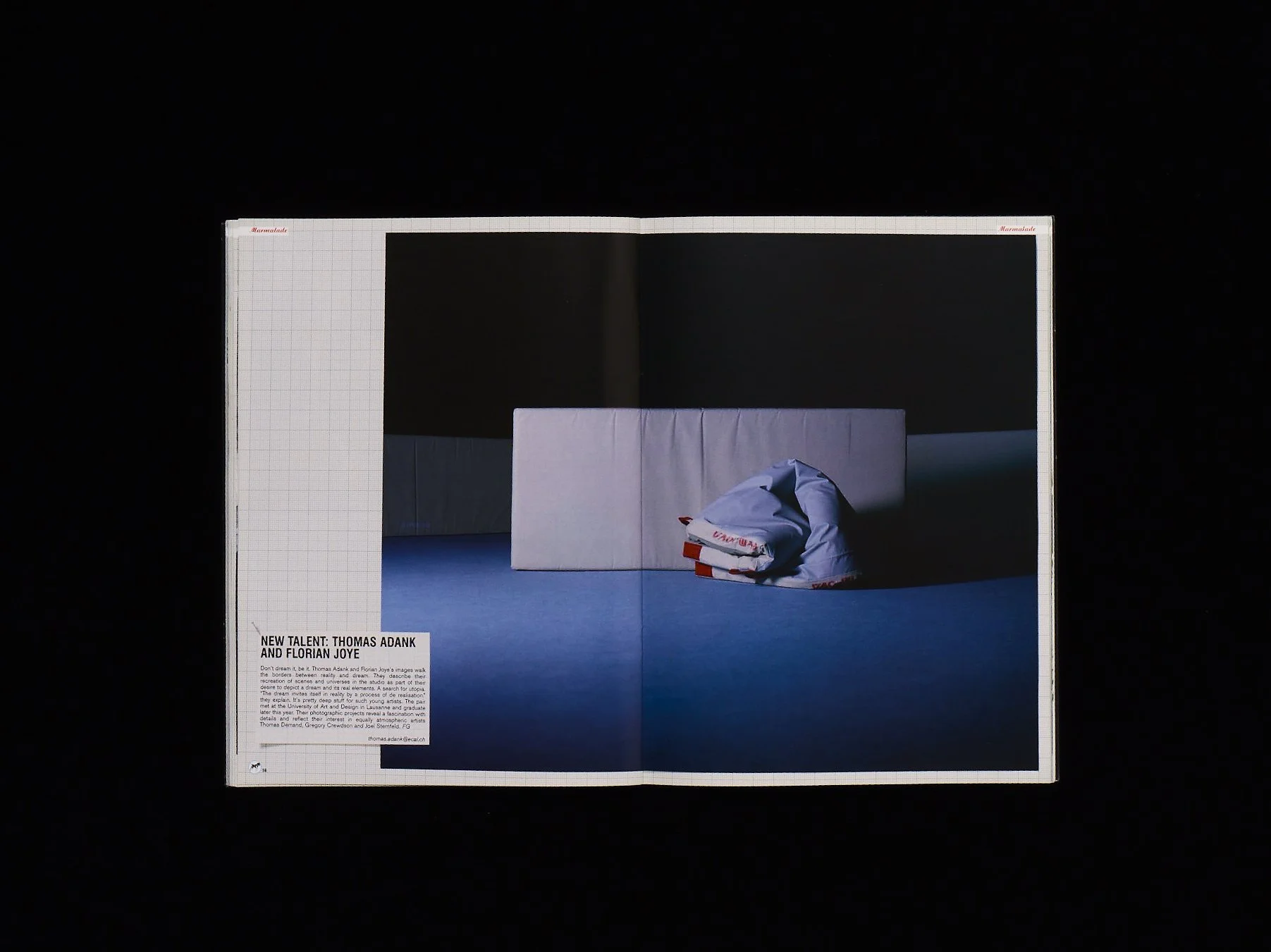


Issue: Being Nice
Materials: White-on-white design elements; green fluorescent accents; black paint.


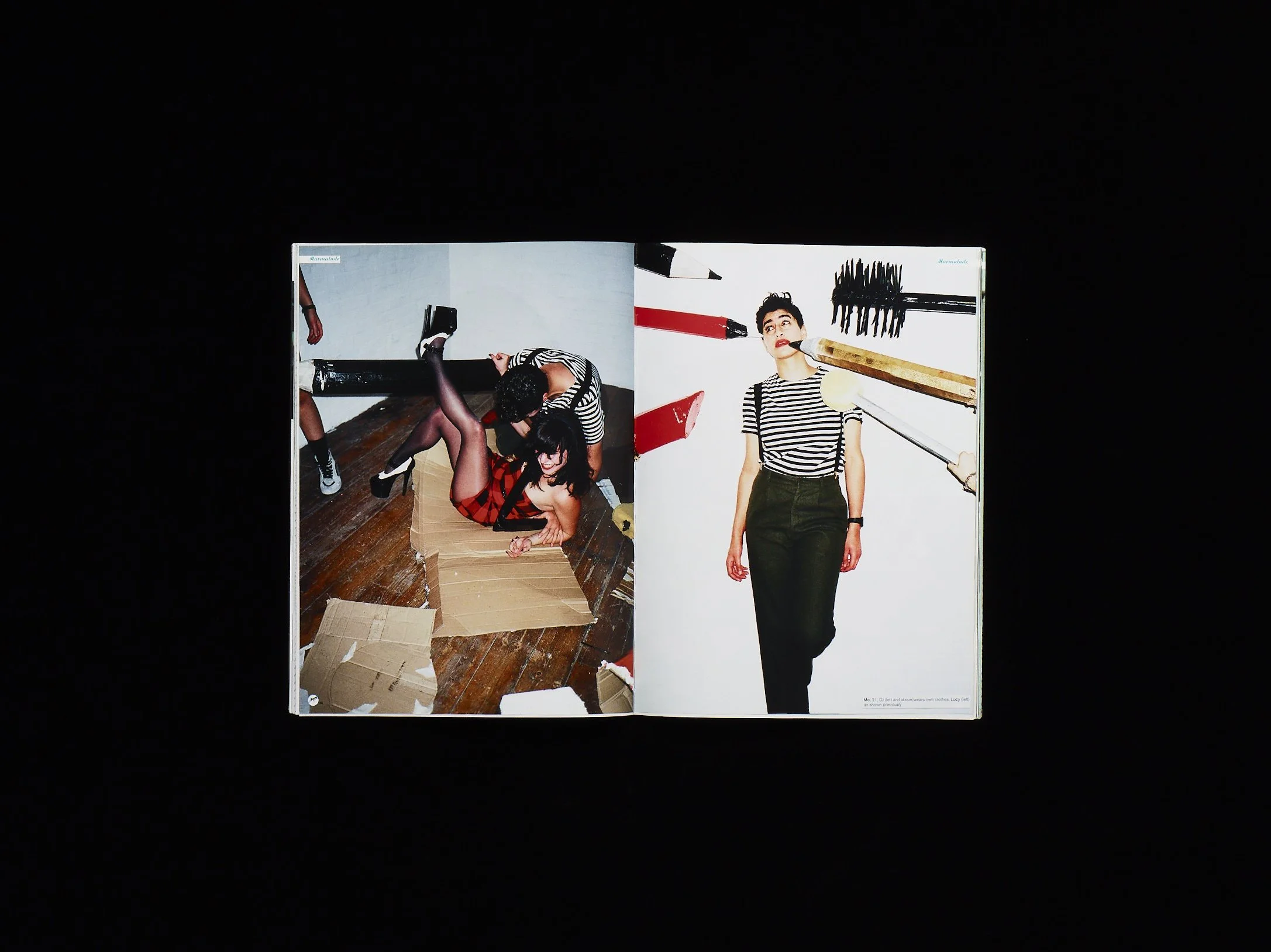


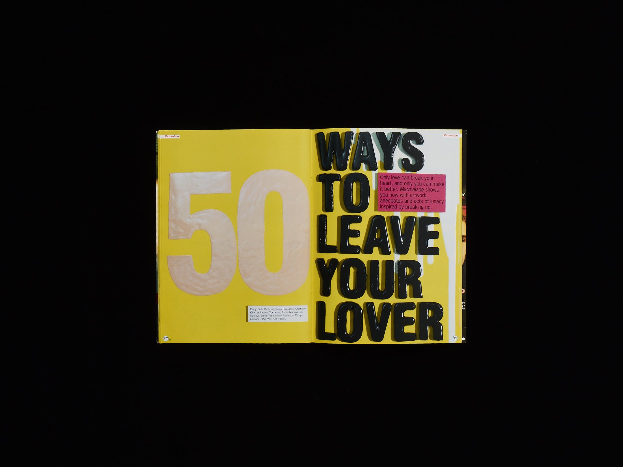
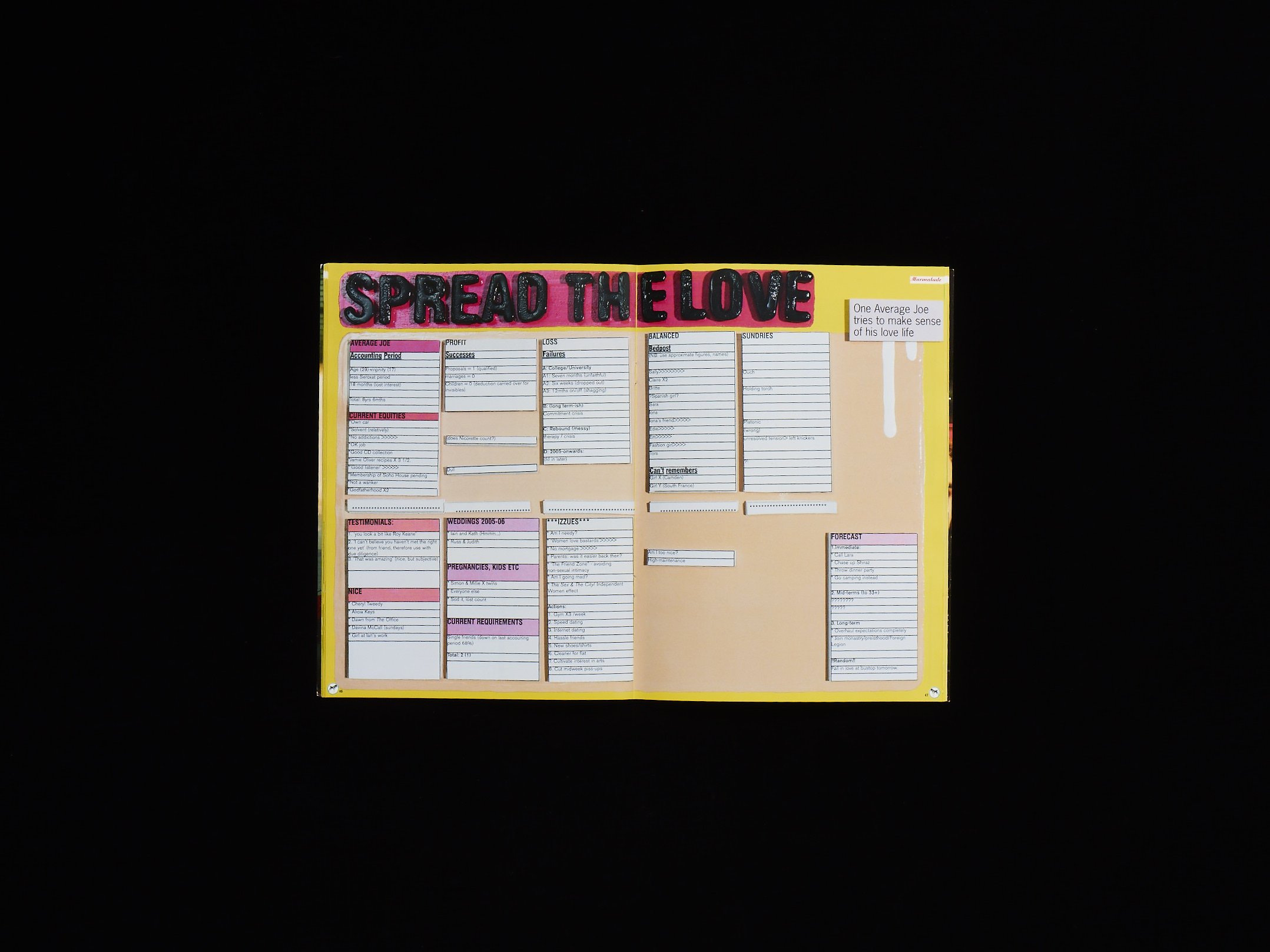
Issue: Sex and Love
Materials: Gloss paint, modelling clay and paper.



LIST OF ISSUES & MATERIALS USED IN THE ART DIRECTION OF EACH
Stroke Me, Pick Me Up | Drawing pins, staples, and paper.
Where Has All The Sex Gone? | Badges, fabric, and embroidery.
Watch Out New Talent | Aluminium, round stickers, and fluorescent colors.
Mistakes | Dollhouse furniture, plain paper, and flocked wallpaper.
Love & Sex |Plaster, Gloss paint and Paper
Make Stuff Not War | Lightbox, lighting gels,and paper.
DIY | Italian hand-made papers, elastic bands,and red tape.
Music | Photocopied texture,colored tapes,and squared paper.
Get Your Leg Up | Drawing pins ,threads,and white-on-white textures.
Le Freak C’est Chic | Black & White checkered patterns and stripes; red & white stripes.
Being Nice | White-on-white design elements; green fluorescent accents; black polka dots.
F**k Art Let’s Dance | Graph paper ,compound cardboard,and preserved insects .
Thanks For The Add | Stickers,negative space ,white against white backgrounds .
New talent
Discovering and promoting new talent has always been a significant aspect of our work. We take pride in showcasing emerging photographers and illustrators, creating a dynamic visual experience within the pages of our magazine. While it posed design challenges with no fixed house style, we ensured that the layout seamlessly integrated these fresh perspectives while allowing them room to shine. Over the years, we have had the pleasure of nurturing numerous talents such as Adele, Henry Holland, and Matt Irwin.
