JAMIE CULLUM, Art Direction
The concept behind Jamie Cullum's visual brand identity revolved around an exploded piano and its many parts, including keys.
Each element, from music video to album packaging, website design to stage design was guided by the brand bible, harmonized seamlessly, allowing for a seamless global campaign.
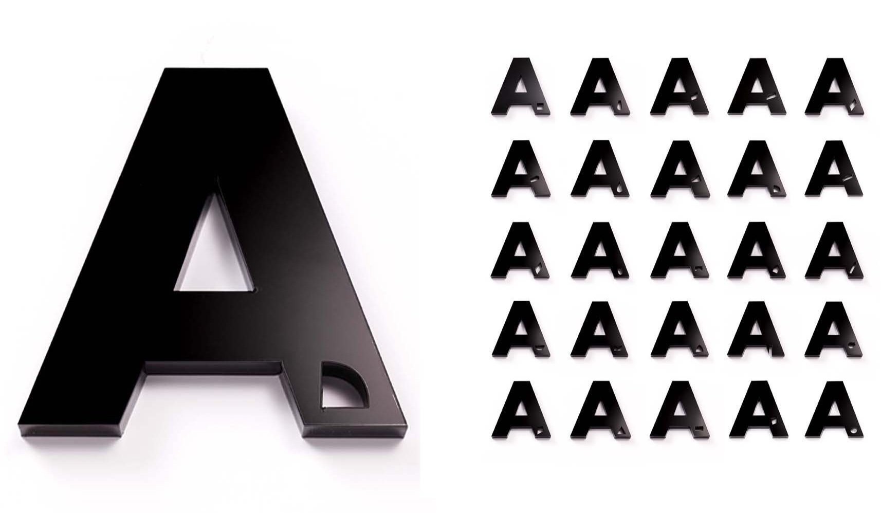
But here's the kicker: the alphabet itself was infused with piano parts, forming a secret code that added an element of intrigue and set the stage for post-album launch marketing and press activities.
Encouraging fans to crack a series of messages that lead to tickets to secret gigs and bonus tracks.


